Redesigning a Core Enterprise Platform
for Business Banking at Scale
Redesigning a Core Enterprise Platform for Business Banking at Scale
Business Online Banking — Galicia Bank

Business Online Banking — Galicia Bank
Galicia Bank
UX/UI Designer (Design Systems & Front-End Implementation)
Argentina
1 year
2013-2014
This project focused on the redesign of Galicia Bank’s Business Online Banking platform, a core enterprise system used by companies to manage financial operations in a highly regulated, high-stakes environment.
The platform supported multiple business roles with different permissions and access levels, where clarity, trust, and correctness were critical. Errors or misunderstandings could directly impact users’ finances, making this a system where design decisions carried real consequences.
This was not a visual refresh. It was a foundational system redesign aimed at improving autonomy, reducing operational overhead, and enabling the platform to scale.
The platform faced several structural challenges:
At the same time, the platform needed to support different business users—administrators, operators, and decision-makers—each with distinct responsibilities, permissions, and visibility.
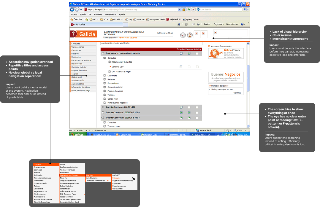
Screenshot of an outdated Online Business Banking interface.
Business users struggled to manage their finances independently. Unclear structure and inconsistent patterns made it difficult to understand:
This uncertainty increased friction, errors, and reliance on external support.
The lack of clarity translated into:
→ Single designer responsible for UX, system logic, and documentation
→ Fixed launch deadline aligned with business objectives (8 months)
→ Highly regulated domain, with no tolerance for failure
→ Concurrent design, development, and documentation required to support migration
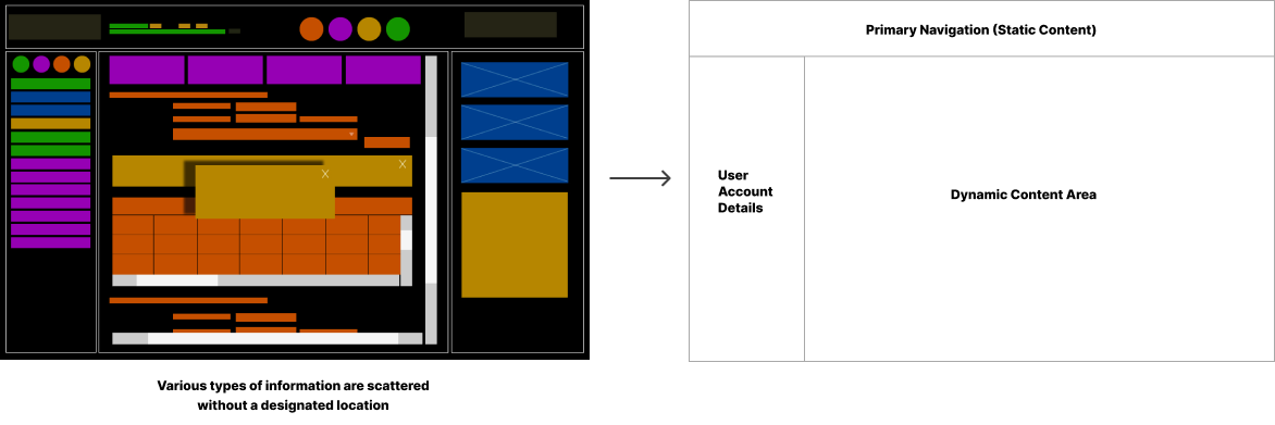
The redesign started by shifting focus from screens to system logic:
Information was reorganized into a clear structure:
This structure aligned the platform with users’ mental models, especially under time pressure.
In this project, navigation was not treated as a visual problem, but as a structural system decision.
The platform needed to support multiple business roles, each with different permissions, responsibilities, and usage frequency. The primary risk was not that users would “fail to find” an option, but that they would misunderstand which actions were available to them in a given context.
Given the volume of functionality and the need to expose it without forcing deep, repetitive navigation paths, I evaluated multiple navigation approaches. We chose a mega menu not for aesthetic reasons, but because it allowed us to:
This decision prioritized clarity and predictability over apparent simplicity, based on the understanding that in enterprise financial systems, hiding complexity often increases risk rather than reducing it.
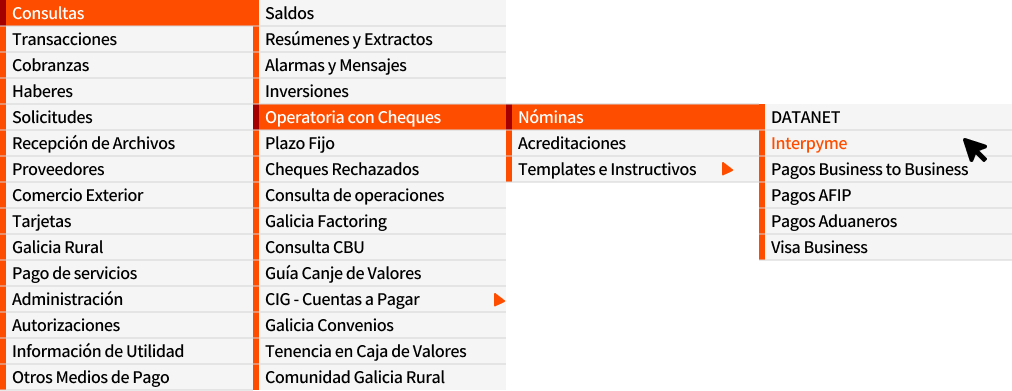
Previous Accordion Menu Design
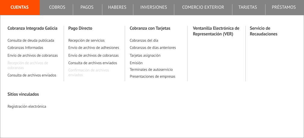
Updated Mega Menu Design
One of the core challenges was translating business rules and permission models into behaviors that users could clearly understand through the interface.
The system needed to communicate, at all times:
Rather than delegating this logic exclusively to the backend or relying on error messages, I focused on making system rules visible through the UI itself—using states, visual hierarchy, repeated patterns, and consistent micro-decisions.
This approach required:
The goal was not only to prevent errors, but to build trust, ensuring the system felt predictable, transparent, and under control—even in complex financial scenarios.
Within a context of technological migration and tight timelines, documentation stopped being a final artifact and became an active part of the system.
As the sole designer on the project, designing, documenting, and implementing happened in parallel. This required treating documentation as a tool for alignment and scalability, rather than a formality.
Documentation enabled us to:
Rather than describing screens, the documentation captured:
This experience shaped a way of working I still use today: designing systems that can survive over time, across team changes, and under evolving business demands.
Documentation Version 2.0 2015.
Following launch, long-time users reported friction adapting to the new system. Given the sensitivity of financial operations, immediate decisions were required.
To protect user trust:
This approach prioritized financial safety and user confidence over design purity.
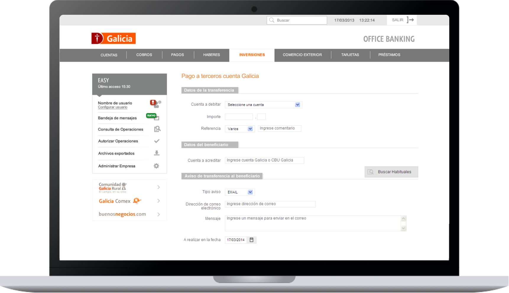
Transfer Details Screen. 2014