From PowerPoint to Pages that Convert

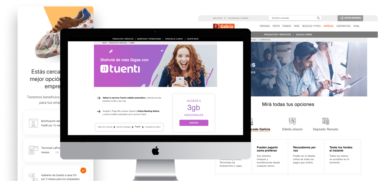
Landing Pages - Galicia Bank

Detail

Galicia Bank

Rol

UX/UI Designer — Marketing Collaboration

Country

Argentina

Period

2014-2020

The Challenge

How do you transform raw, business-heavy requirements into digital experiences that feel clear, trustworthy, and relevant, often for multiple audiences at once?

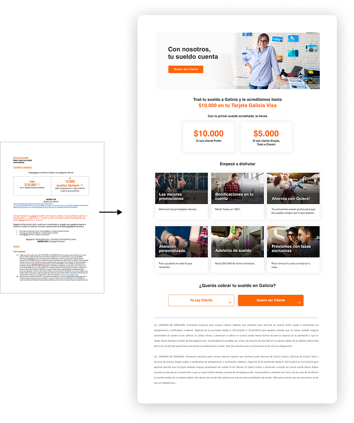
Landing page projects rarely started with a design brief.
 They started with PowerPoint or Word documents:

  • Dense campaign copy
  • Product rules and conditions
  • Legal requirements
  • Business-driven CTAs

Outcomes at a Glance

My Process: From Brief to Page

Where It Started: The Raw Brief

Marketing provided:

  • Campaign objectives
  • Product benefits
  • Legal copy
  • Required CTAs

While complete from a business perspective, these inputs:

  • Lacked hierarchy
  • Were text-heavy
  • Were not designed for user flow or comprehension

Turning Requirements and Research into Hierarchy

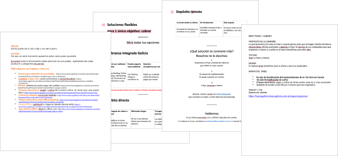
Alongside the brief, the marketing team shared:

  • Research insights
  • Survey data
  • Campaign learnings

Together, we identified what each audience cared about most.

I translated this into a clear structure:

  • Short, scannable headlines for first-time visitors
  • Progressive disclosure for users seeking details
  • Clear CTAs aligned to different user intents

One Page, Multiple Audiences

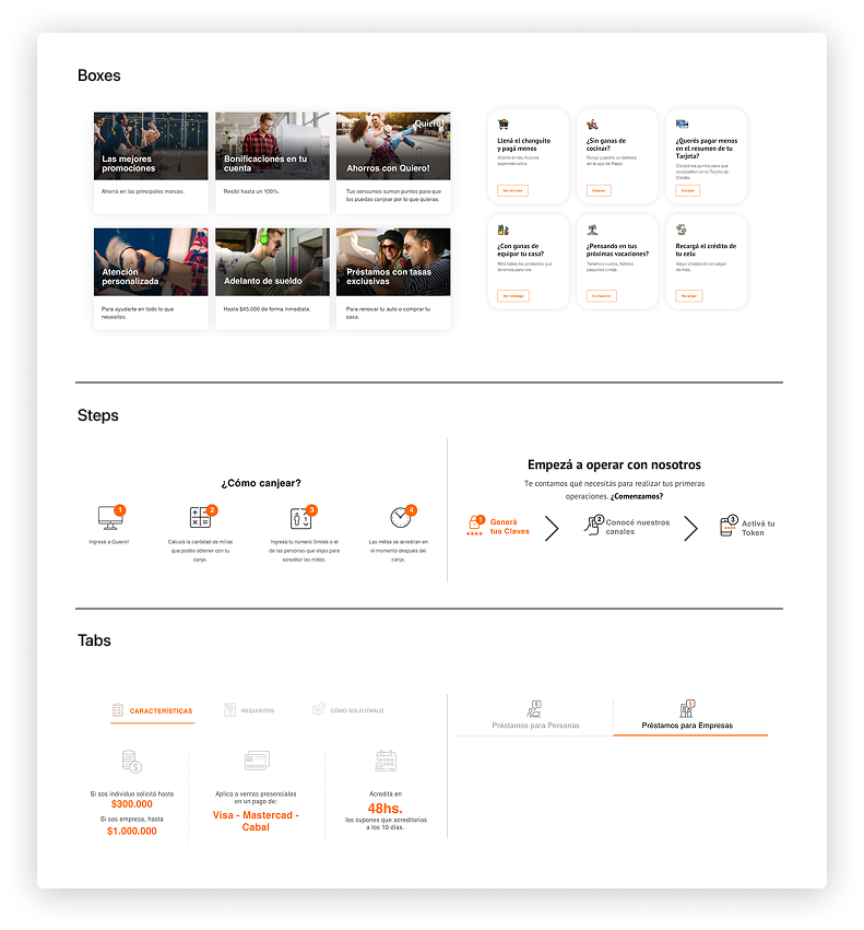
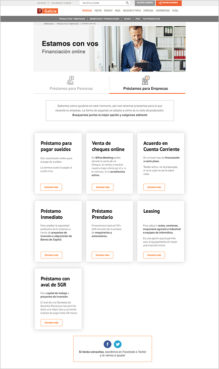
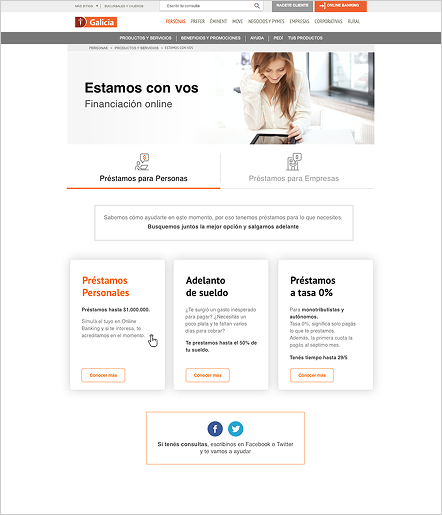
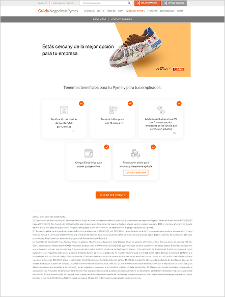
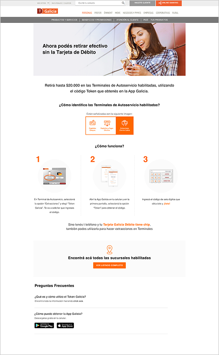
Each landing page needed to speak to very different users:

  • Individual clients
    • Young adults opening their first account
    • Premium clients expecting speed, trust, and exclusivity
  • Business clients (Empresas)
    • SMEs and companies seeking clear information on loans, deposits, and financial solutions

Designing for Multi-Audiences

  • Applied Galicia’s brand system to ensure consistency and credibility
  • Simplified financial language in close collaboration with Marketing
  • Designed mobile-first, critical for younger audiences
  • Balanced clarity for individuals with credibility for business users

The goal was not to add content—but to offer clear entry points so each user could quickly find what mattered to them.

Measuring & Iterating with Data

Each landing page marked the start of learning, not the end.

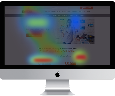
We analyzed behavior using:

  • Hotjar (heatmaps, scroll depth, click patterns)
  • Google Analytics (bounce rate, conversion funnels)

This revealed:

  • Which sections attracted attention
  • Where users dropped off
  • Which CTAs performed best

With every new campaign, we applied these insights to refine:

  • Content order
  • Visual hierarchy
  • CTA placement

Creating a continuous cycle of design, measurement, and improvement.

Impact: From Slides to Performance

  • 25% increase in conversions and interactions
  • Improved retention through clearer information structure
  • Stronger collaboration between Marketing, Design, and Development
  • Scalable patterns reused across campaigns

Reflection & Key Learnings

Designing for multiple audiences isn’t about adding more.

It’s about clarity, choice, and flexible entry points—so each user finds what they need without friction.

Key takeaways:

  • Data as a compass → Hotjar and GA grounded design decisions in evidence, not opinion
  • Collaboration drives results → Working closely with Marketing allowed business goals and user needs to align
  • Imagery builds trust → Curated visuals humanized financial products and increased approachability
  • Iteration is power → Each landing page fed insights directly into the next, improving outcomes over time