UX Awakening
Business Online Banking

Business Online Banking
Galicia Bank
UX/UI Designer and Coder (HTML/CSS)
Argentina
1 year
2013-2014
In my inaugural adventure on a complex project, leading the transformation of Business Banking, I embarked on a journey that fueled my curiosity for User Experience.
This opportunity immersed me in Design Systems and introduced me to Design Thinking, opening my eyes to an entirely new world of design
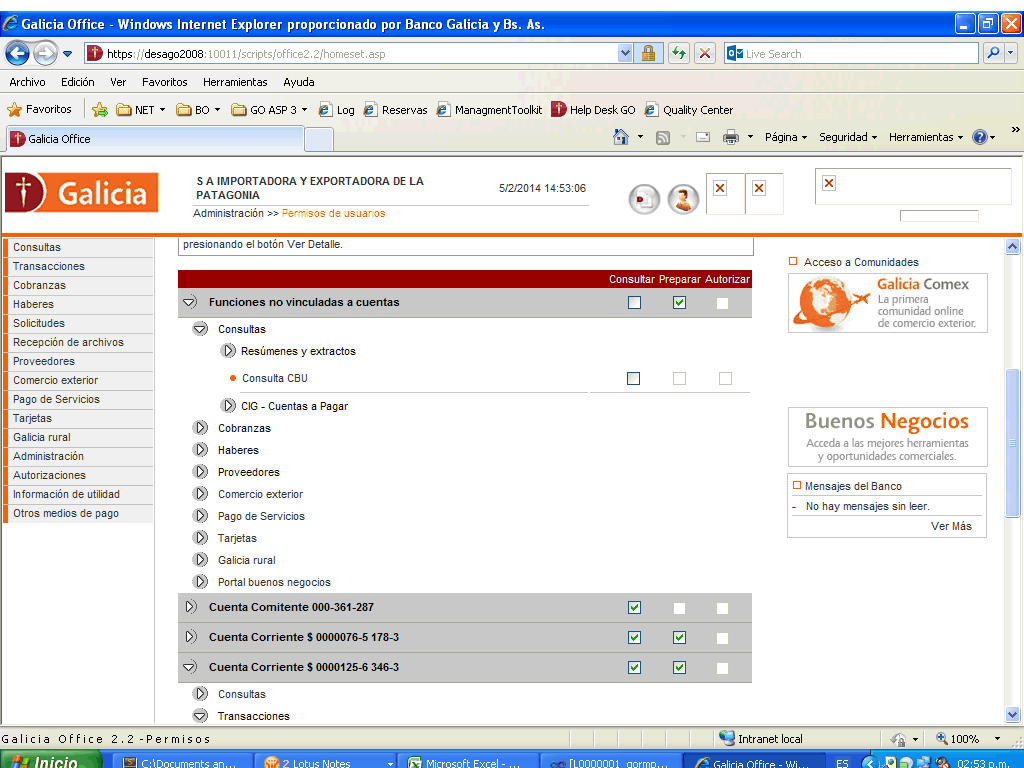
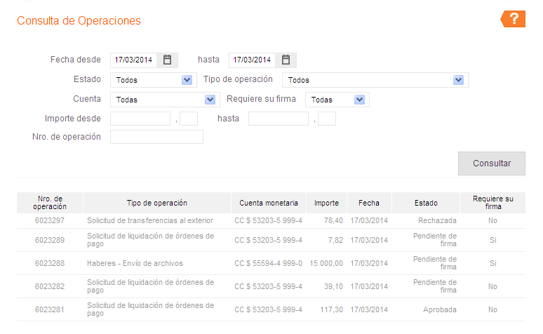
Screenshot of an outdated Online Business Banking interface.
Users are unable to manage their finances independently without relying on multiple communication channels.
Struggling to complete their tasks due to uncertainty about how information is organized and displayed on the platform.
Our call center requires significant resources, and marketing heavily invests in guiding customers on our platform. We need to optimize these resources to enhance customer satisfaction and reduce costs.
Day of launch: The launch date aligned with specific business objectives, requiring collaboration across departments for a successful rollout in only 8 months.
One designer: Limited budget necessitated solo tackling of various challenges, including bias, redundancy, and lack of detailed refinement.
Documentation: Crucial timing required dynamic and comprehensive documentation to facilitate efficient problem-solving by the development team.
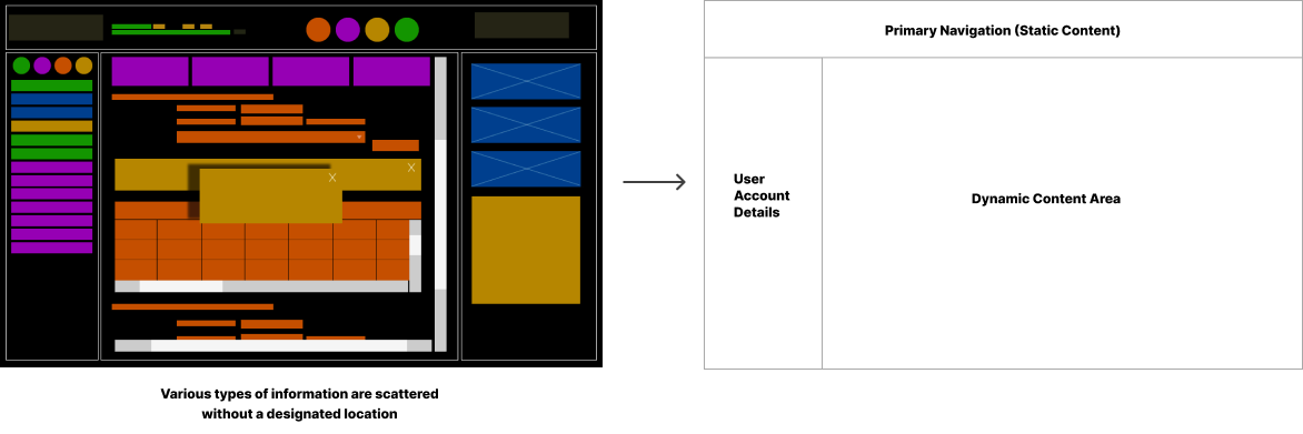
The new layout establishes a hierarchy of content, prioritizing important information and directing user attention to key areas of the interface.
The information was scattered across the entire screen. We reorganized it into main groups and subgroups. We defined three sectors:
New menu was organised in a way that reflects the user's mental model, allowing them to easily anticipate where information is located and how to access it. We implementing a new labelling, categorization, and establishing a user-friendly navigation system that promotes seamless access to information.
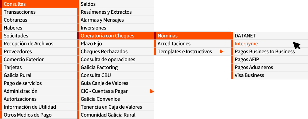
Previous Accordion Menu Design
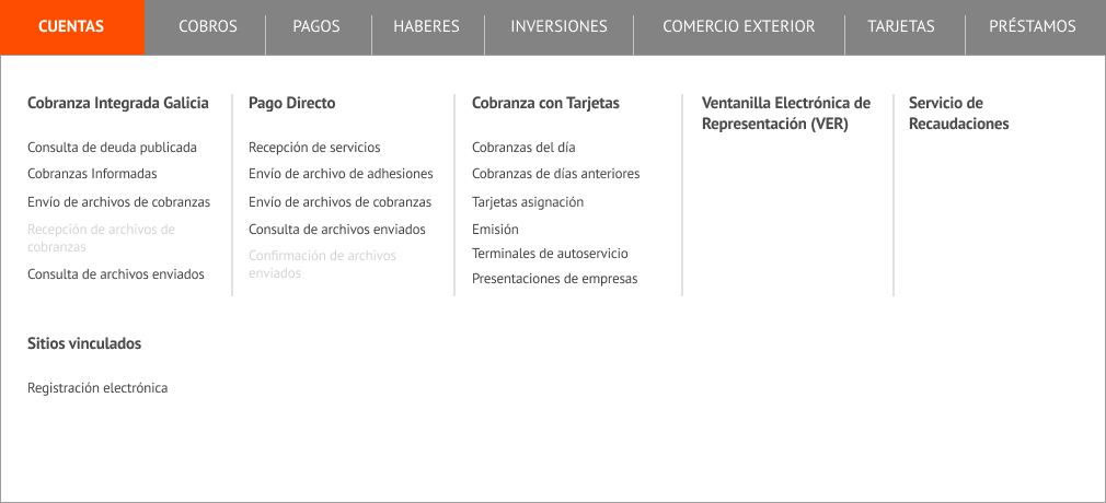
Updated Mega Menu Design
Five advantage of usign Mega Menu:
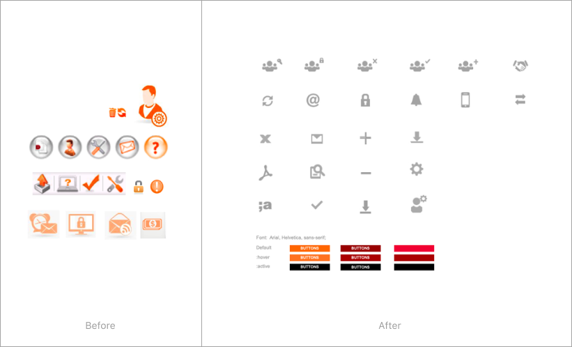
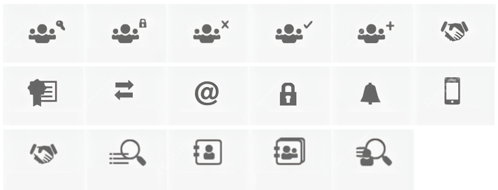
It was time to systematize and organize the different styles within the interface. Using brand definitions, I created new icons and elements to establish the visual language of the new design system.
New cohesive set of icon designs.
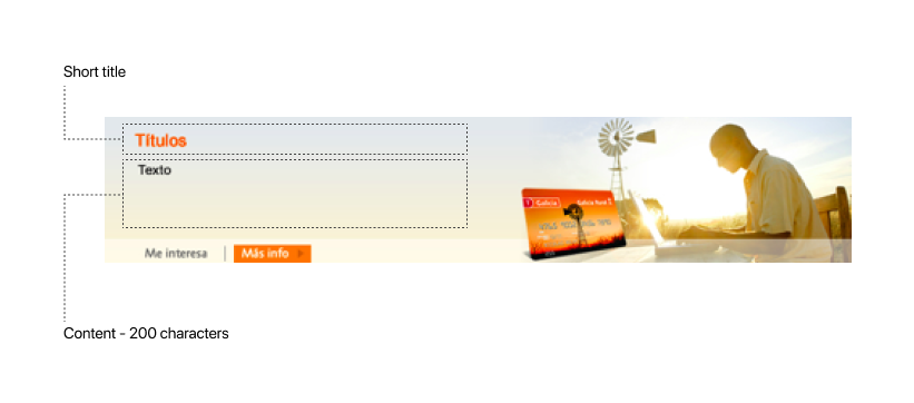
The banner was designed to display dynamic information. We established a character limit to effectively convey daily messages to users. Notifications were also designed according to our design principles. This approach was essential for maintaining consistency with our style guidelines and ensuring that our communications seamlessly integrate with the overall visual aesthetic.
With the idea of atomic design methodology, I designed the different atoms that we can use to create more complex structures (Headings, subheadings, labels, dropdown menus, buttons, links, etc.). This method gives us the flexibility to build to the needs of the site and also aligns with the design style guide.
To ensure seamless communication with the development team, creating documentation was the final, yet crucial, step. Design and code must coexist harmoniously.
The style documentation ensures that all developers follow a consistent design. The team can consult the documentation and apply the established styles directly, speeding up the development process and improving efficiency.
Documentation Version 2.0 2015.
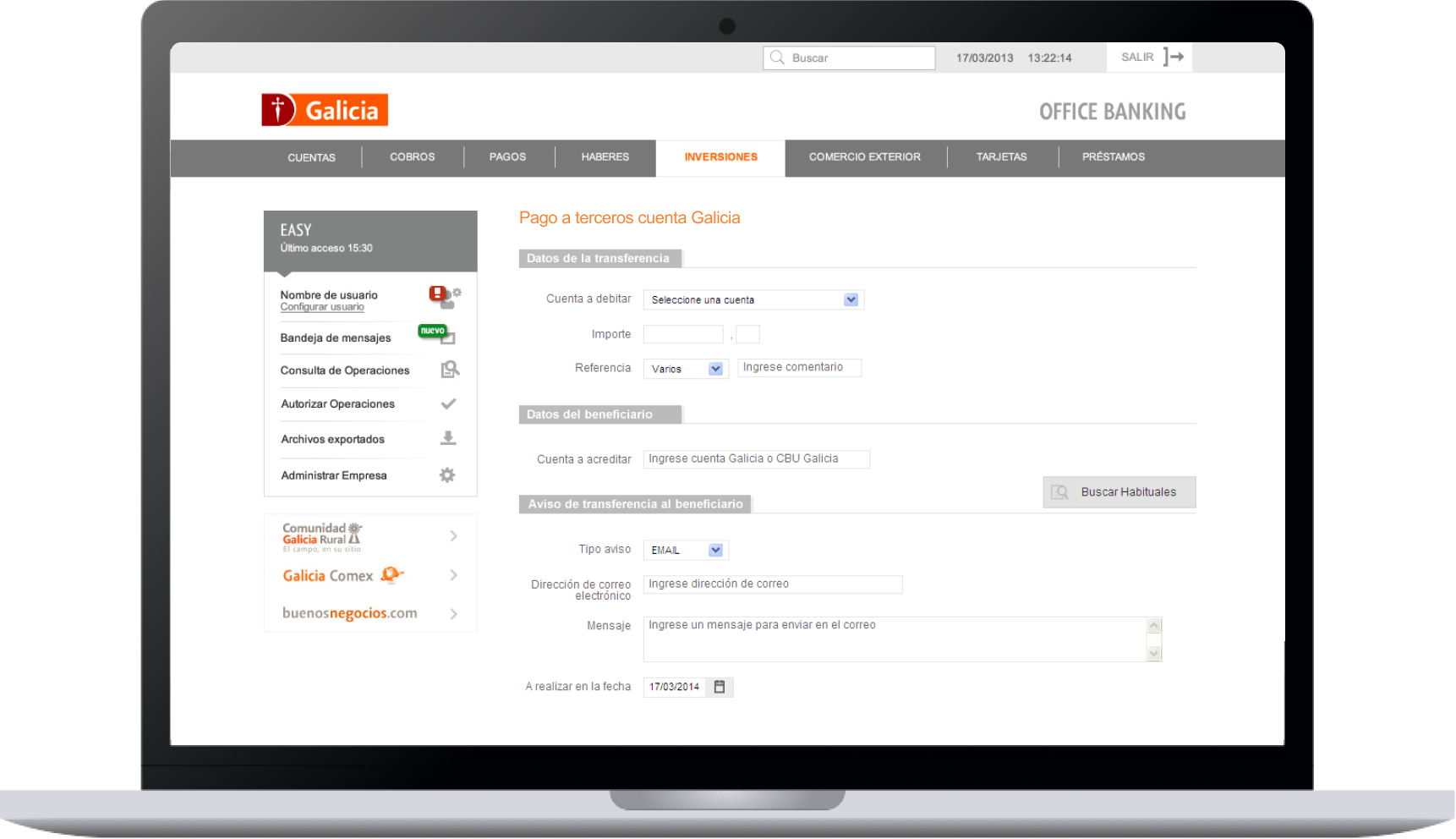
Transfer Details Screen. 2014
After several months of designing, coding, and documenting, the big day finally arrived. Launch day was just the beginning of an exciting journey.
I worked closely with two departments:
We anticipated that this complete overhaul would be challenging for our users and expected they would need assistance. However, we were overwhelmed by the volume of complaints, which was a significant setback for us.
Quick decisions had to be made. Our users' finances depend entirely on us, so to address the complaints, we decided to have the two systems coexist. This decision would give us the time to analyze and resolve the numerous issues expressed by users.
Step by step, we began releasing video tutorials on how to use the app. At that time, it was more common for users to rely on the call center to address all their issues. After a couple of months, we learned a few crucial things:
Context, users, behaviors—everything changes; nothing remains static. It's imperative to always stay close to the user's voice through listening, designing, and testing. Iteration is the best way to stay up-to-date with our users.
We continued learning for years, and this was my first introduction to the amazing and passionate world of User Experience.